5.2.2. The Illusion of Feature Importance- When Visual Tools Mislead
** 5.2.2 The Illusion of Feature Importance: When Visual Tools Mislead
In complex AI systems, tools like SHAP, LIME, and (1) saliency maps are widely used to help users understand model behavior. These methods generate visual or numerical attributions to indicate how inputs influenced outputs. But while they offer clarity on the surface, they often mask the deeper logic of the model. The explanations they produce can align with human expectations rather than with the model’s true internal computation.
- A visualization that highlights regions or features of input data deemed important by a model for making its decision.
This creates an illusion of transparency, where what looks like insight may instead conceal the system’s actual reasoning.
When Explanations Fail in Practice
The gap between interpretability and causality surfaces repeatedly across domains:
- Legal AI: LLM tools like DoNotPay fabricated case citations while offering confident explanations for their inclusion.
- Hiring systems: Tools like SHAP and LIME highlighted non-causal features (e.g., ZIP code, font size) as influential, while the model’s actual logic ignored them1.
- Finance and medical AI: Local approximations (e.g., linear regressions around a data point) produced believable but unstable attributions that shifted dramatically with input noise.
In all these cases, the explanation aligned with what users expected to see, not with how the model actually made its decision.
🔍 Why Do Visual Tools Mislead?
Tools like SHAP and LIME provide local approximations of input influence. They highlight which features might have mattered for a specific prediction by simulating or perturbing inputs. But they don’t trace the true activation paths or causal chains inside the model. Small changes in input can cause large swings in attribution, especially in complex models.
As noted in ISO/IEC 24028:2020 and ISO/IEC 23894:2023, interpretability should reveal internal mechanisms, not just correlate inputs and outputs. When post-hoc tools emphasize plausibility over faithfulness, they risk creating false confidence rather than genuine insight.
🧰 SHAP and LIME: How They Work, Where They Fall Short
SHAP assigns feature contributions using Shapley values from game theory. It quantifies how each feature moves the model’s prediction relative to a baseline. Visuals like waterfall plots make this intuitive, showing how individual features push the output toward or away from a decision threshold. But these plots can create a false sense of causality if users mistake these additive contributions for evidence of true internal computation.
SHAP waterfall plots illustrate how features combine to influence a single prediction. Each bar represents a feature’s contribution to moving the model’s output from the baseline toward the final score.
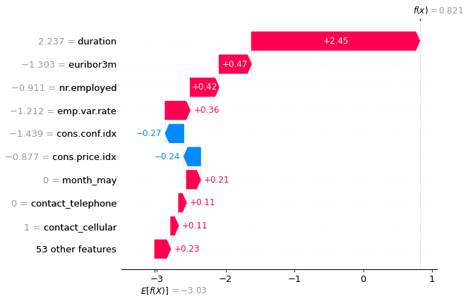
This figure shows a SHAP waterfall plot illustrating how individual features contribute positively or negatively to a model’s final prediction. It highlights additive feature attributions relative to a baseline. Source: MiniMaTech.
TRAI Challenges: SHAP Explanation Audit

Scenario:
You are tasked with auditing a model for flower classification (Iris dataset). You use SHAP to explain a prediction, but notice that small input changes cause large shifts in feature attribution.
🎯 Your Challenge:
1. Run SHAP on the first Iris sample and generate a force plot.
2. Slightly modify one input feature (e.g., add +0.1 to sepal length) and generate the plot again.
3. Identify and discuss:
- Which features’ importance changed disproportionately?
- Why does this illustrate the risk of relying solely on post-hoc explanations (see Section 5.2.1)?
4. Propose one method to pair SHAP with a more faithful explanation tool (e.g., causal diagnostic).
💡 Starter code:
import shap
from sklearn.datasets import load_iris
from sklearn.tree import DecisionTreeClassifier

# Load data and train model
X, y = load_iris(return_X_y=True)
model = DecisionTreeClassifier().fit(X, y)

# SHAP explanation for original input
explainer = shap.TreeExplainer(model)
shap_values = explainer.shap_values(X[:1])

shap.initjs()
shap.force_plot(explainer.expected_value[0], shap_values[0], X[:1])

# Modify input slightly
X_perturbed = X[:1].copy()
X_perturbed[0][0] += 0.1
shap_values_perturbed = explainer.shap_values(X_perturbed)

shap.force_plot(explainer.expected_value[0], shap_values_perturbed[0], X_perturbed)
📌 Reference:
SHAP official documentation
LIME builds a (2) local surrogate model (typically linear) around a specific data point to approximate the behavior of a complex model in that local region. The resulting bar charts or decision plots show how features contribute to each class prediction within this simplified model. But it’s crucial to remember: these visualizations describe the surrogate’s logic, not the true internal reasoning of the original model.
- A simplified model (e.g., linear regression) fitted around a specific data point to approximate the behavior of a complex model in that local area.
The example below shows a LIME explanation for a diabetes prediction task. Features are presented as contributing either toward the "Has diabetes" or "No diabetes" class, with their influence visualized as weighted bars in the surrogate model.
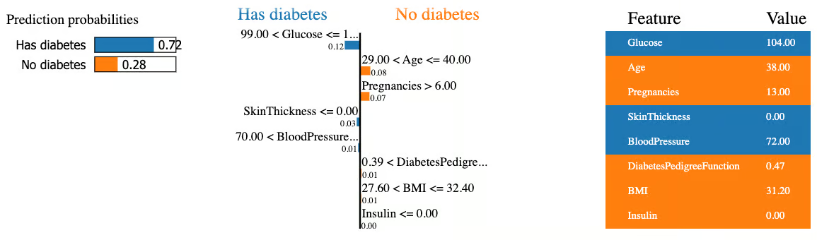
This figure illustrates a LIME explanation showing how individual features influenced a model’s diabetes prediction. Features contribute toward either the “Has diabetes” or “No diabetes” outcome in a locally interpretable surrogate model. Source: DataCamp.
As we have seen, tools like SHAP and LIME can give the impression of transparency or interpretability. The example below highlights why true trustworthiness requires combining transparency, interpretability, and explainability, not relying on one alone.
THINKBOX: Transparency vs Interpretability vs Explainability — An Example
👉 Imagine a neural network that predicts whether a loan applicant should be approved.
-
Transparency: The model’s architecture, code, training data, and parameters are all published. Anyone can see how it was built — but understanding it requires deep technical expertise.
-
Interpretability: The model is designed so that a human reviewer can see that, for example, higher income and lower debt consistently lead to approval. Its decision patterns align with human reasoning, making it easier to follow.
-
Explainability: When the model rejects a loan, it generates a clear reason: “Rejected because debt-to-income ratio exceeded threshold and credit history length was below minimum.” The user can understand why this specific decision was made.
📌 Key takeaway:
Transparency lets you see inside the model. Interpretability helps you grasp its patterns. Explainability tells you why this decision happened. A trustworthy system brings all three together.
🔧 How Do We Solve It?
To improve faithfulness in feature attribution:
- Combine SHAP/LIME outputs with causal diagnostics, not just local approximations.
- Pair visual attributions with layer-wise relevance propagation or integrated gradients to trace deeper reasoning.
- Flag when explanations are unstable or highly input-sensitive, so users know when to be cautious.
Bibliography
-
Ribeiro, M. T., Singh, S., & Guestrin, C. (2016). "Why Should I Trust You?": Explaining the Predictions of Any Classifier. In Proceedings of the 22nd ACM SIGKDD. https://doi.org/10.1145/2939672.2939778 ↩